ANTIOCH
PHOENIX
This project aimed to transform one of the largest unused walls in an organizations lobby into a dynamic, physical information hub—a centralized space for key updates, mission-focused messaging, and actionable resources.
CLIENT
Antioch Phoenix
Physical Information Hub
DELIVERABLES
Lead Designer (Art Direction,
UX/UI Design)
ROLE
THE
CHALLENGE
The organization needed to move key updates, events, and mission content from digital channels into a central physical space in their new lobby. While many members used online platforms, a significant portion struggled with technology or did not engage regularly, leaving them uninformed and disconnected. The challenge was to design a clear, inclusive, and engaging physical information hub that was clear and user-friendly.
RESEARCH
+ PLANNING
To understand the problem, I first analyzed the organizations demographic data alongside web and social media analytics to identify community members less active online and likely missing key information. I then conducted interviews with people of varied ages, tech comfort, and involvement to uncover their needs, preferences, and barriers in accessing information.
USER PERSONAS
Next, I developed detailed user personas based on insights gathered from interviews, highlighting key user groups, their behaviors, motivations, and challenges. These personas became the foundational building blocks for crafting a truly user-centered design approach. By gaining a clear understanding of who the users are and what they need, this process ensured every design decision prioritized the user experience, fostering inclusivity and enhancing overall accessibility and usability throughout the project.

MARTHA
• Age 68
• Tech xp: LOW
• LONGTIME MEMBER
-
Martha prefers face-to-face interactions and rarely uses digital platforms. She values clear, visible information she can quickly scan during her weekly visits. She sometimes struggles with small text and dim lighting. Her main goal is to stay informed about upcoming events and volunteer opportunities without feeling overwhelmed by technology.

JASON
• Age 38
• TECH XP: MODERATE
• BUSY PARENT
-
Jason frequently accesses information on his phone but often misses emails or social posts due to a busy schedule. He appreciates quick, easy-to-digest updates he can check during short visits. Physical reminders in the lobby help him stay connected and engaged with the organization’s activities and programs.

LEAH
• Age 24
• TECH XP: HIGH
• NEWCOMER
-
Leah is comfortable with digital tools but values a welcoming, organized physical space to learn about the organization’s mission and how to get involved. She looks for clear signage and interactive elements that help her quickly find relevant information and feel part of the community from her first visit.
"Research revealed that hidden assumptions in communication had unintentionally excluded a key demographic, highlighting the need for an inclusive design that ensured vital information was accessible to all."
DESIGNING
THE SOLUTION
SKETCHES + WIREFRAMES
Building on research insights, I sketched layouts focused on clarity, inclusivity, and adaptability. The design needed to serve both first time visitors and long time members by supporting quick scanning, easy navigation, and physical interaction. Flexibility was key to ensure the space could evolve with seasonal changes and event specific needs while keeping information accessible and engaging.
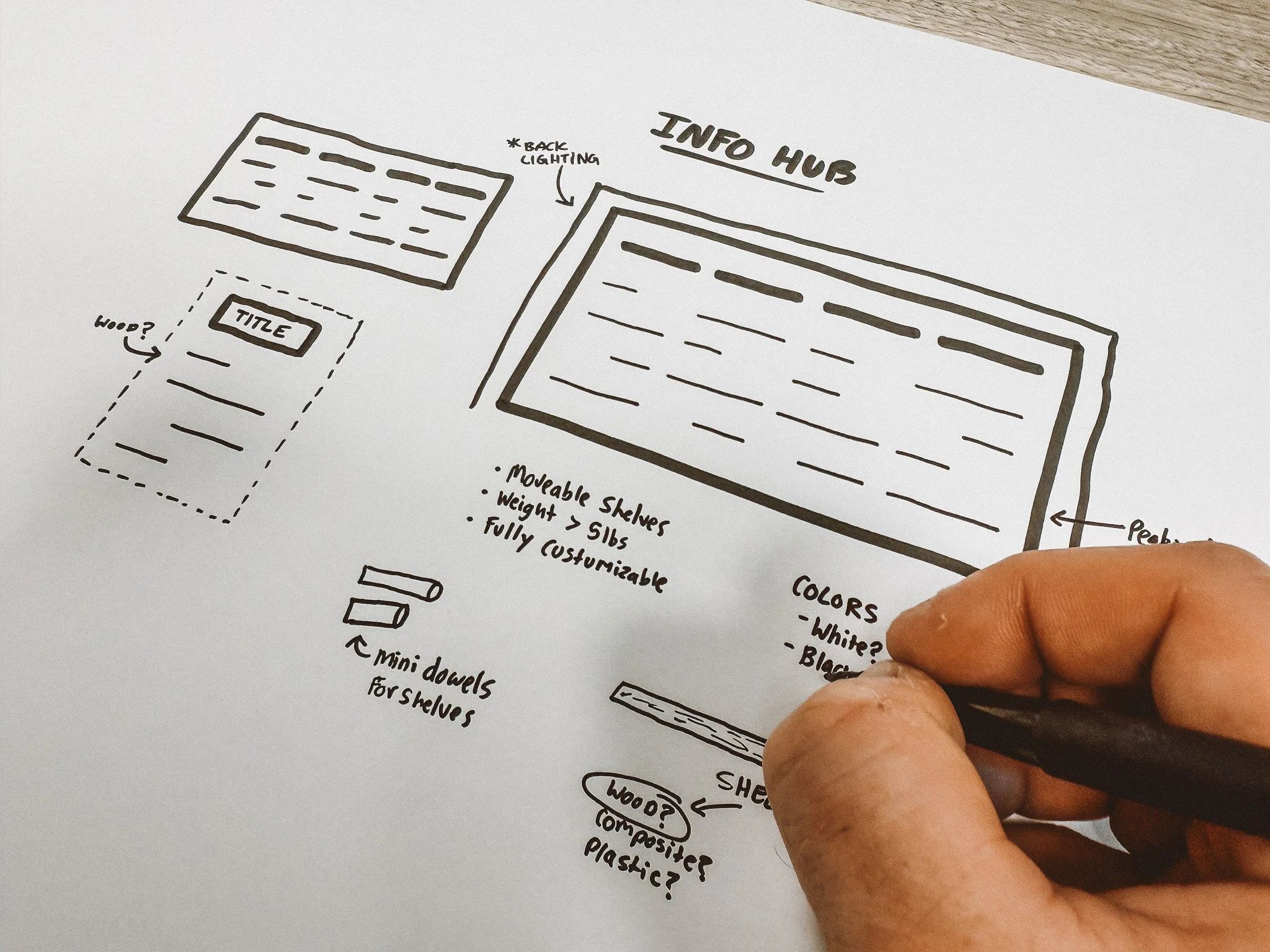

HIGH-FIDELITY MOCKUPS
Using the sketches as a foundation, I built high-fidelity mockups to visualize the space in its real-world context. These were shared in stakeholder meetings, where feedback led to refinements in layout, lighting, and usability features. Once approved, I packaged the final design into a contractor-ready presentation, complete with dimensions, material specs, and modular guidelines to inform the construction process.

THE
RESULT
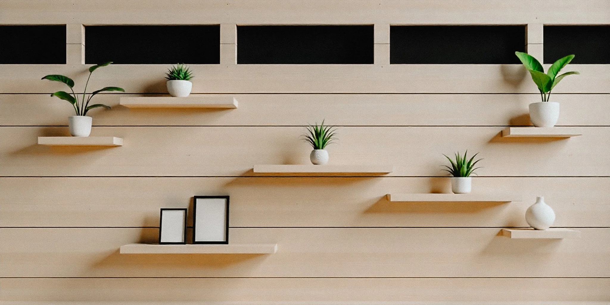
The completed information hub transformed the lobby into a welcoming center of connection, creating an inclusive display that improved communication across the organization. A versatile pegboard with adjustable shelves allowed content to change easily, while integrated lighting enhanced visibility for those with limited eyesight.
Its modular design made the layout adaptable to evolving needs, keeping the space fresh and relevant. The result was a human centered solution that kept every member connected to key updates and opportunities without relying soley on digital platforms.


CONCLUSION
This project reinforced that UX extends far beyond the screen. The same principles of inclusive design that shape effective digital products are just as essential in physical environments. By questioning assumptions and prioritizing accessibility, the information hub evolved into a central point of connection for the entire community. It also highlighted the importance of collaboration, from early research with members to ongoing coordination with stakeholders and contractors. Most importantly, it demonstrated that when design is people focused, it leads to big impact.