WORLD
MANDATE PHX
This project aimed to enhance the registration experience for a large-scale nonprofit conference by reducing user friction, lowering operational costs, and improving overall usability.
CLIENT
Antioch Community Church
Event Registration UI
DELIVERABLES
Lead Designer (Art Direction,
UX/UI Design)
ROLE
THE
CHALLENGE
A large nonprofit conference was losing time, money, and attendee trust to a registration process plagued by unclear information and poorly sequenced choices. Users frequently stalled or selected the wrong options, creating unnecessary support requests and straining staff capacity. With mounting processing fees and a belief that a costly platform replacement might be inevitable, the challenge was to define a path to a smoother, more intuitive registration experience that would reduce user friction, lower operational strain, and protect the budget.
RESEARCH
+ PLANNING
To gain a deep understanding of the problem at hand, I met with key stakeholders to surface their goals and frustrations, interviewed past attendees to uncover pain points, and audited the current registration platform to identify hidden flexibility.
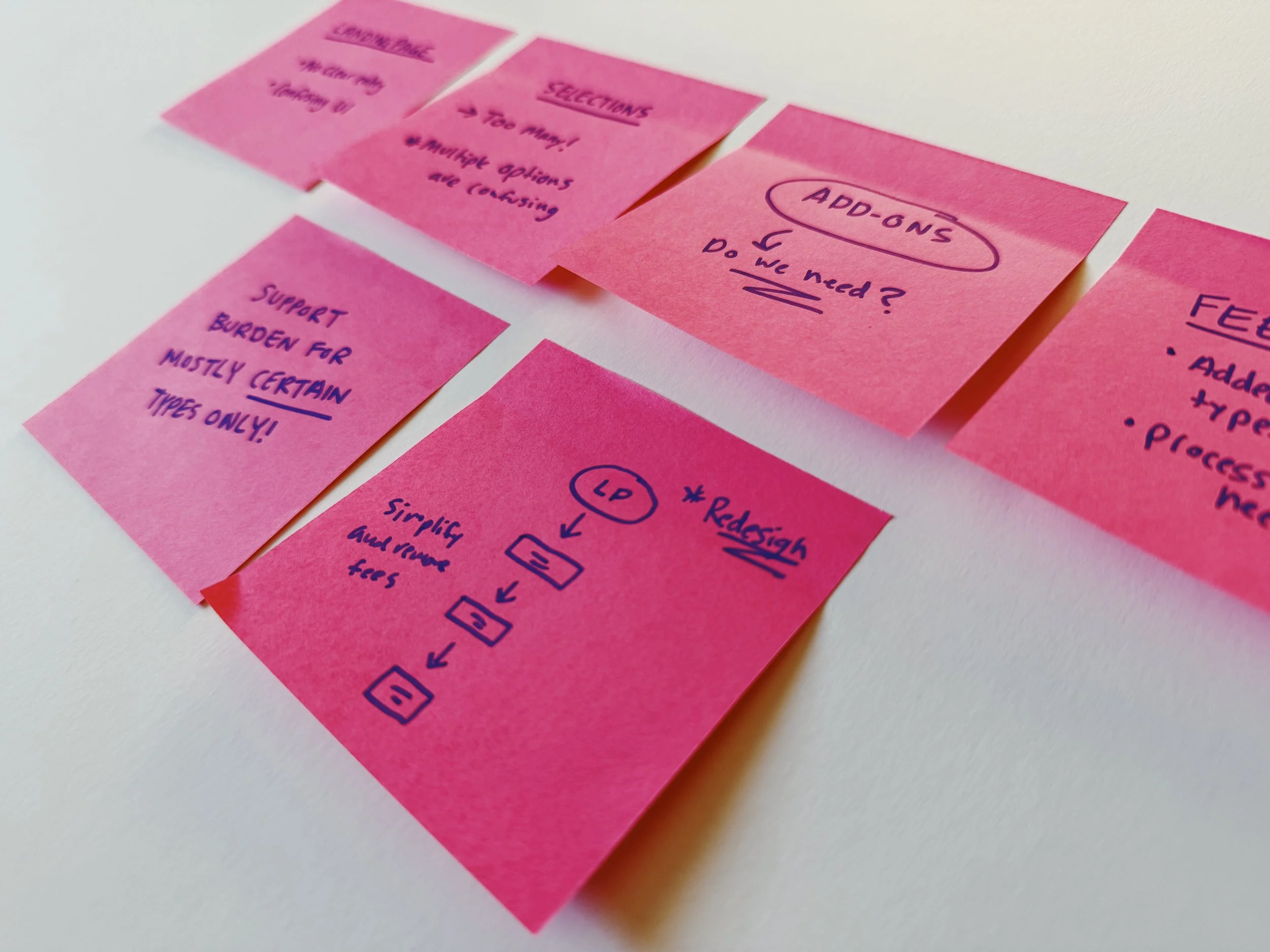
What surfaced was a confusing information architecture that left users stuck or selecting the wrong options. Internally, stakeholders felt constrained by growing processing fees and believed the only viable solution was to switch to a complex and costly third party platform.
01
USER INTERVIEWS
Users felt confused and unconfident navigating the registration process, unsure which options to choose or what fees to expect.
02
Market Research
Competitor analysis showed that simpler and more transparent flows are industry standard, particularly in mobile-first experiences.
03
Technical Audit
Support teams received a high volume of emails from users needing assistance to complete registration which led to frustrations
"Through this process, I discovered that the core issues weren’t technical limitations—they were usability challenges. A thoughtful UX redesign could solve the problems without replacing the system, saving the client significant time and money."
DESIGNING
THE SOLUTION
USER FLOWS
I started by asking, “How might we redesign the registration experience using the existing platform to reduce confusion, lower support burden, and eliminate unnecessary costs — without requiring a full platform rebuild?”
I went straight to work mapping the current user flow to find friction points, bottlenecks, and unnecessary steps. This confirmed a need for a revised information architecture focused on clarity, reducing redundancy, and simplifying key actions.
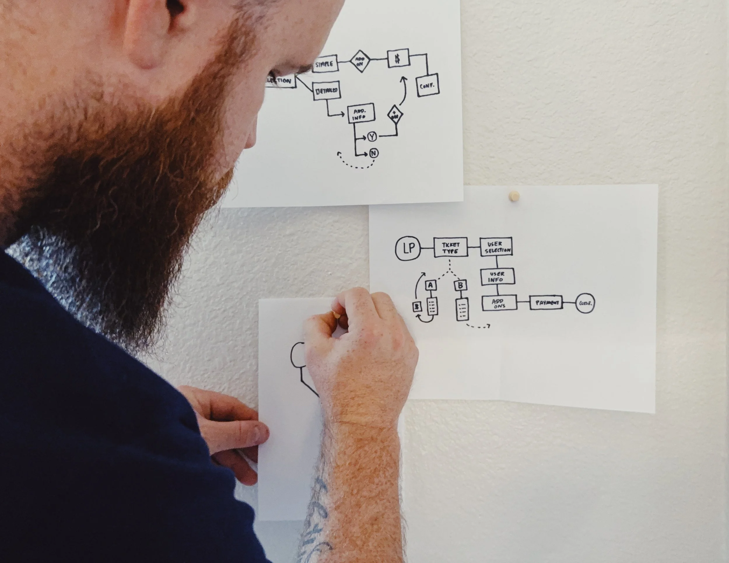
SKETCHES & PROTOTYPES
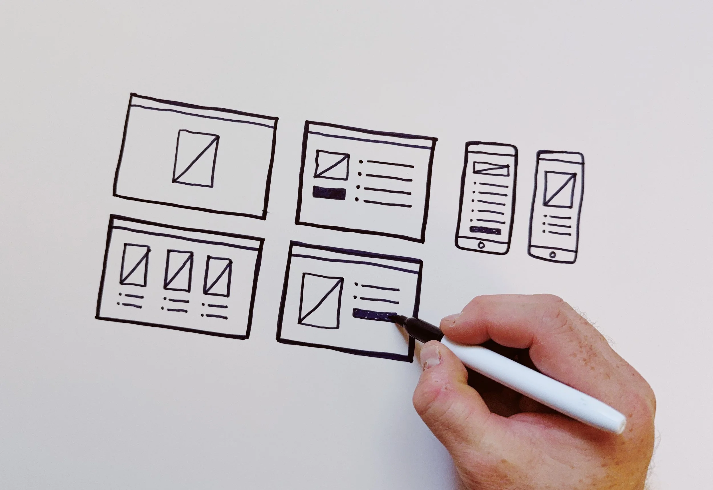
Building on the outlined user flow, I translated the journey into initial wireframe sketches, mapping out the key interactions and content structure. From there, I developed a high-fidelity, interactive prototype that reflected the conference brand to create a seamless, start-to-finish experience. I tested the prototype with users, gathering feedback to validate improvements and iterating on language, visual hierarchy, and confirmation steps until the flow felt clear and intuitive.
THE
RESULT
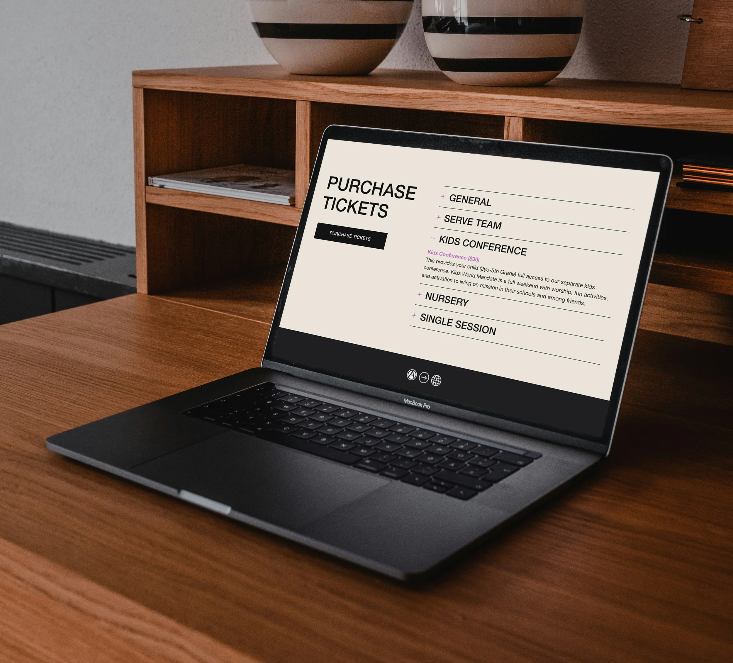
The registration experience was rebuilt from the ground up with a fully re-envisioned UI, clear visual hierarchy, and purposeful use of color and typography. A branded landing page tied everything together, reflecting the conference identity and building trust from the first click. Designed for seamless viewing on any device, the new experience was visually engaging, intuitive, and elevated the event’s overall brand presence.

CONCLUSION
This project reminded me of the importance of challenging assumptions – both my own and the client’s. What initially seemed like a need for a costly platform overhaul became an opportunity to solve real problems through thoughtful, user-centered design. It reinforced how small, strategic adjustments, paired with strong visual design, can create big impact. Most of all, it highlighted the power of research, collaboration, and designing within constraints to deliver impactful and scalable solutions.